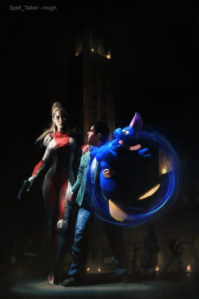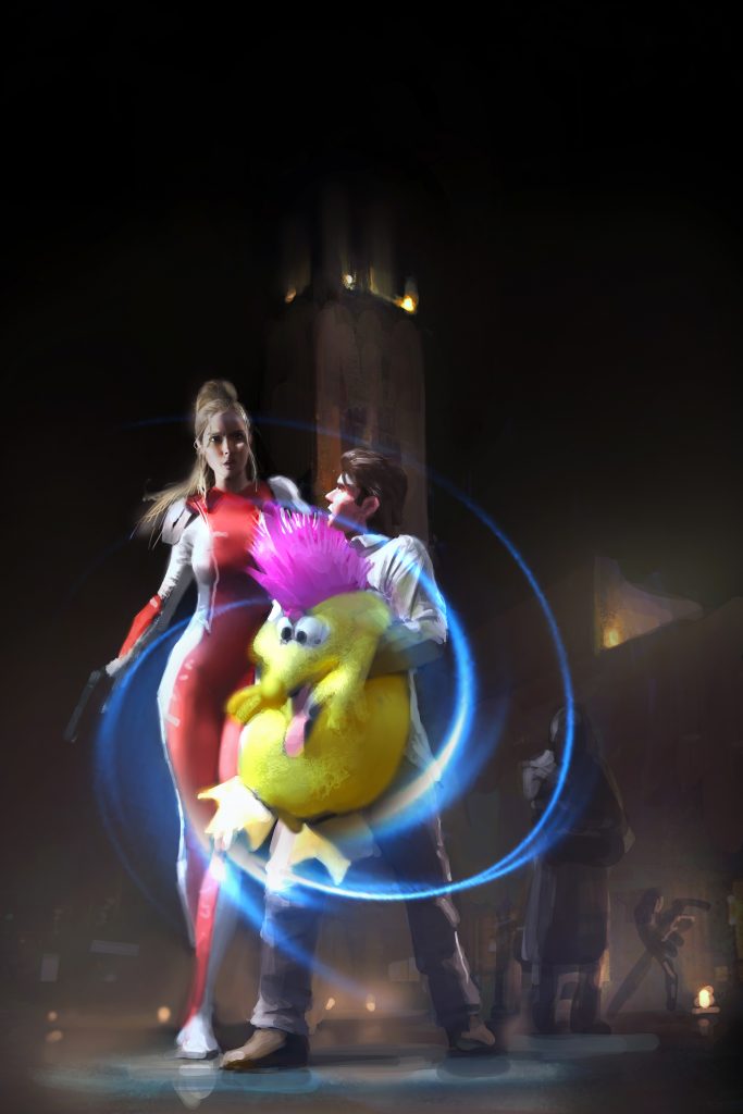
I didn’t explain myself well to my artist and he lightened up the colors of everything. I wanted to go for a https://en.wikipedia.org/wiki/Chiaroscuro technique. What do you think between the two covers. Forget there is more detail or less. I’m talking about the high contrast or just having it darkish?